You’ll need the GoVeda MCP server connected first. It takes about a minute. See Connect to Claude or ChatGPT to set it up. Once it’s connected, just ask your question; your assistant reaches for GoVeda on its own when a patent task needs it. New accounts get a 14-day free trial with 10,000 credits.
A company’s patent count tells you how big the portfolio is. What it’s actually about is the more useful question. Name the company and your assistant groups its patents by technology area and charts the spread.
The prompt
Open a new chat and paste:
Map out Samsung’s patent portfolio by technology area. Resolve the company first, then pull a representative sample of its patents and group them by CPC technology area (rolled up to the class or subclass level). Render the distribution as a chart in an artifact (treemap or horizontal bar). Below the chart, tell me the 3–4 areas they concentrate in and anything surprising. State your sample size and method.
What GoVeda does behind the scenes
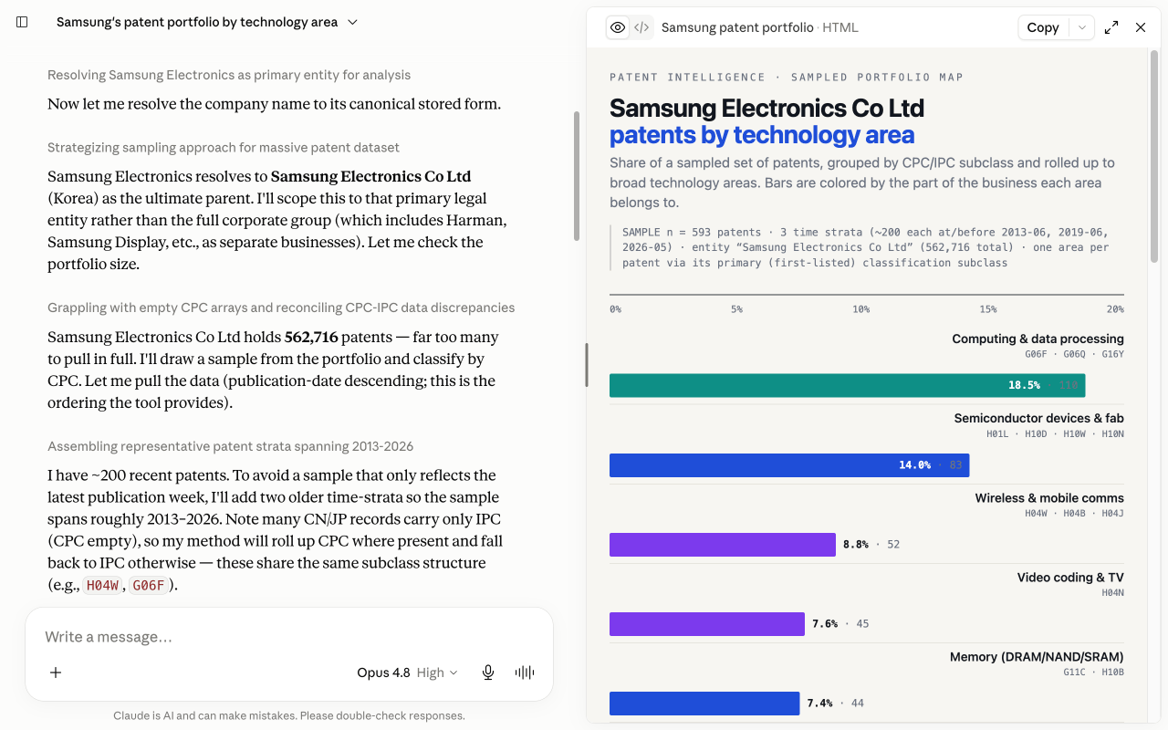
The portfolio is too big to read end to end, so the assistant works from a sample and is upfront about it:
Resolve the company
It calls lookup_party to turn “Samsung” into the exact assignee names on patent records, so the sample is drawn from the right entity, not a similarly named one.
Pull a representative sample
It uses party_patents to page a sample of the portfolio and tells you how many patents that sample covers, so the chart comes with its own footnote.
Group by CPC area
Each patent in that sample already carries its CPC and IPC codes, so the assistant rolls those up to the class or subclass level and tallies how many fall in each technology area, with no extra per-patent lookups needed.
Chart the distribution
It renders the tally as a treemap or horizontal bar chart in an artifact, so the concentration is visible at the class level.
You can watch it sample, classify, and chart in the chat:
What you get
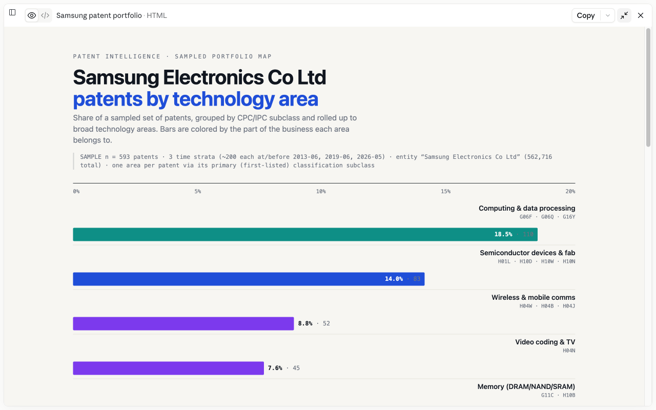
You get a chart of the portfolio by technology area, the three or four areas the company concentrates in, and a note on anything surprising, like a technology you wouldn’t expect them to be filing in, or a gap where you’d expect strength. It states the sample size and method, so you know it’s reading a slice, not claiming to have classified every patent.
Tips
A bigger sample steadies the picture. Each party_patents page costs 1 credit and already includes classification codes, so ask for the sample size that fits how precise you need the split to be. Swap in any company. To compare several companies in one area instead of mapping one company across areas, see Visualize a Competitive Landscape.
Next: browse more use cases or read the MCP tool reference.