You’ll need the GoVeda MCP server connected first. It takes about a minute. See Connect to Claude or ChatGPT to set it up. Once it’s connected, just ask your question; your assistant reaches for GoVeda on its own when a patent task needs it. New accounts get a 14-day free trial with 10,000 credits.
Is a company filing more patents than it used to, or fewer? Name it and a time window, and your assistant counts patents per year and plots the curve, so the trend is something you can see.
The prompt
Open a new chat and paste:
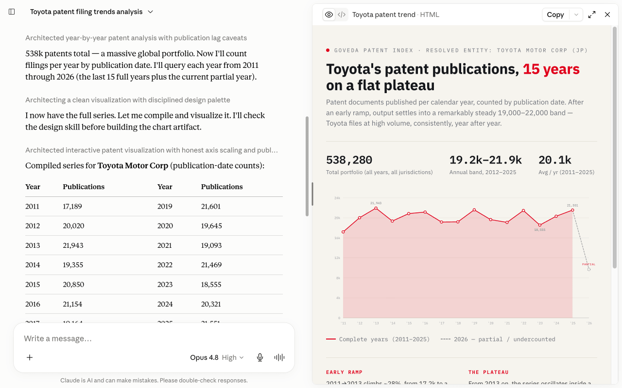
Chart Toyota’s patent filing trend over the last 15 years. Resolve the company first, then count filings per year by publication date and plot them as a line chart in an artifact. Point out where filings accelerated or dropped off, and flag that the most recent year or two may be undercounted because of publication lag.
What GoVeda does behind the scenes
It’s a short, count-driven chain, and the assistant narrates each step:
Resolve the company
It calls lookup_party to pin “Toyota” to its exact assignee names, so the per-year counts capture the right entity.
Count per year
It calls party_count once for each year in the window, each call filtered to that year’s publication dates, a steady proxy for filing activity, with the lag noted below.
Plot the line
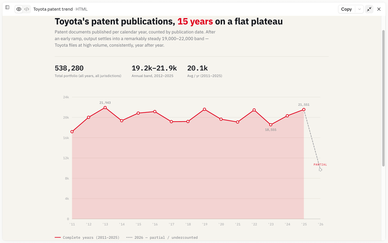
It renders the per-year counts as a line chart in an artifact, so the shape of the trend is easy to read.
Read the curve
It points out where the line climbs or dips and ties those moves to a plain-English read.
You can watch it count year by year and plot the curve in the chat:
What you get
You get a line chart of patents per year, a read on where filings accelerated or fell off, and an honest caveat: the most recent year or two usually looks lower than it really is, because patents publish months to years after they’re filed. The curve shows direction, not a precise headcount.
Tips
Counting by publication date is the reliable way to do this. Filing dates trickle in for years, so a recent-year count keeps changing. Read the curve for direction rather than exact totals, and discount the last year or two. Swap in any company and any window.
Next: browse more use cases or read the MCP tool reference.